By the end of this session, we’ll have the header finished, and we can move on to learn about repeating sections in the next session!
Filling It In
Okay! After last session, we’ve got the skeleton of our character sheet built. First, let’s turn off the background colors, at least on powers and information. Then, let’s add a little bit of padding to every .section class. This will make our text not-so-near to the edges. We’ll also get things centered and learn about display: flex!
1
2
3
4
5
6
7
8
9
10
11
12
.section {
    /* ... */
    padding: 10px;
}

.powers {
    background-color: #d68b8b; /* Remove this line */
}

.information {
    background-color: #8bd4d6;  /* Remove this line */
}
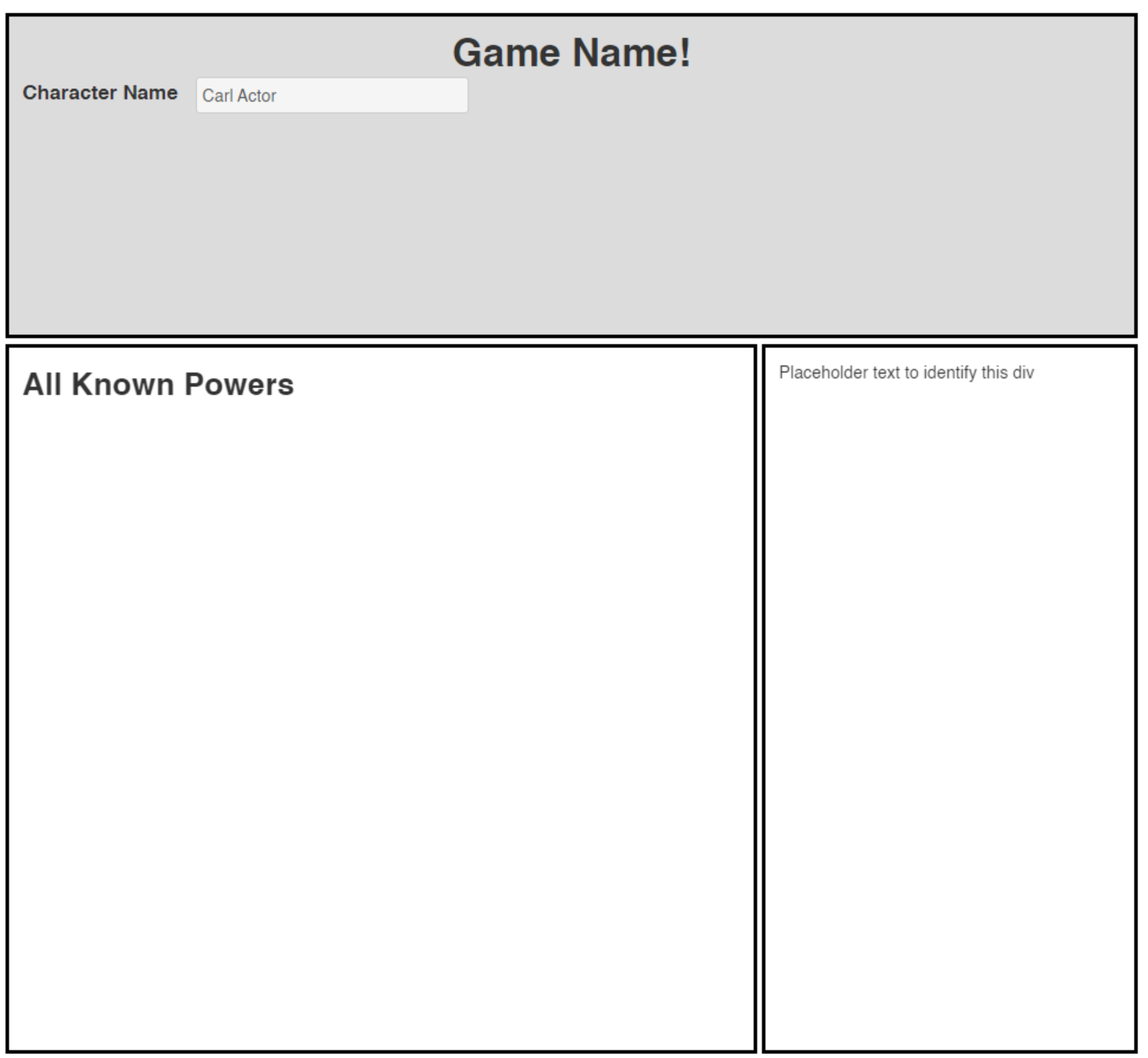 Our de-colored character sheet
Introducing Flex
Let’s focus on the header section. As you may remember, the original Cyberrats character sheet has a header that looks like this:
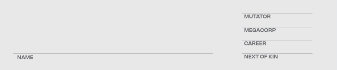
Let’s make a list of the changes we need to make:
- Move Name to bottom
- Add Mutator / Megacorp / Career / Next of Kin to the right
- Put a line above each of the descriptors
- Make the words all caps
That seems pretty doable. Let’s take them in order.
Note: The way we are tackling these issues is not the ideal order. This way requires we re-write part of our code and restructure our document.
This is intentional. You WILL have to change approaches as you go. Proper planning can alleviate some of that, but the way to gain that experience is by doing. The more CSS and HTML you write, the better able you will be to come up with the right structure from the start. It’s a learned skill.
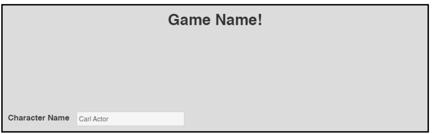
The wrong way
Don’t do this.
We COULD move the name to the bottom using position: relative and the top proeprty. This works, but it means adding a new class to both the label and the input (or else adding a sibling selector, which we’ll learn about next session). Worse than that, it means hard-coding a height based on our header’s height, which we could change later. Doing that might give us the following:
1
2
3
<h1>Game Name!</h1>
<label class="inline bottom" for="character-name">Character Name</label>
<input class="bottom" type="text" id="character-name" name="attr_character_name"/>
and CSS:
1
2
3
4
.bottom {
    position: relative;
    top: 160px;
}
 It works, but it’s fragile and should feel bad.
There’s got to be a better way, right? Good news!
The Slightly Better Way
I hope you’re thinking to yourself two things: the first is that hardcoding in a number of pixels for positioning feels fragile and bad, and second that duplicating a class on two elements next to each other feels redundant and bad.
Solving the second of these two problems is a step in the right direction. Instead of adding the same class to both our input and our label, let’s instead wrap them both in a span.
Remember: If you ever want to group things, put them in a
divorspan.
Then we can give that span a class of “bottom”, in just one place. This gives us:
1
2
3
4
<span class="bottom">
    <label class="inline" for="character-name">Character Name</label>
    <input type="text" id="character-name" name="attr_character_name"/>
</span>
Our previous code still works, but let’s learn a better way: Flex.
The Right Way
We’ll rename our “bottom” class shortly, but we can leave it as-is for now.
In our CSS, we want to change .header to have a display of flex. Flex is used to allow an element’s immediate children to space themselves out based on some rules we provide. In this case, our header div only has two children, the h1, and our bottom span. So if we tell the div to treat itself as a column and space out its children as much as possible, that should give us what we want:
1
2
3
4
5
6
7
8
9
10
11
.bottom {
/* Delete everything here */
}

.header {
    /* ... */
    display: flex;
    flex-direction: column;
    justify-content: space-between;
}
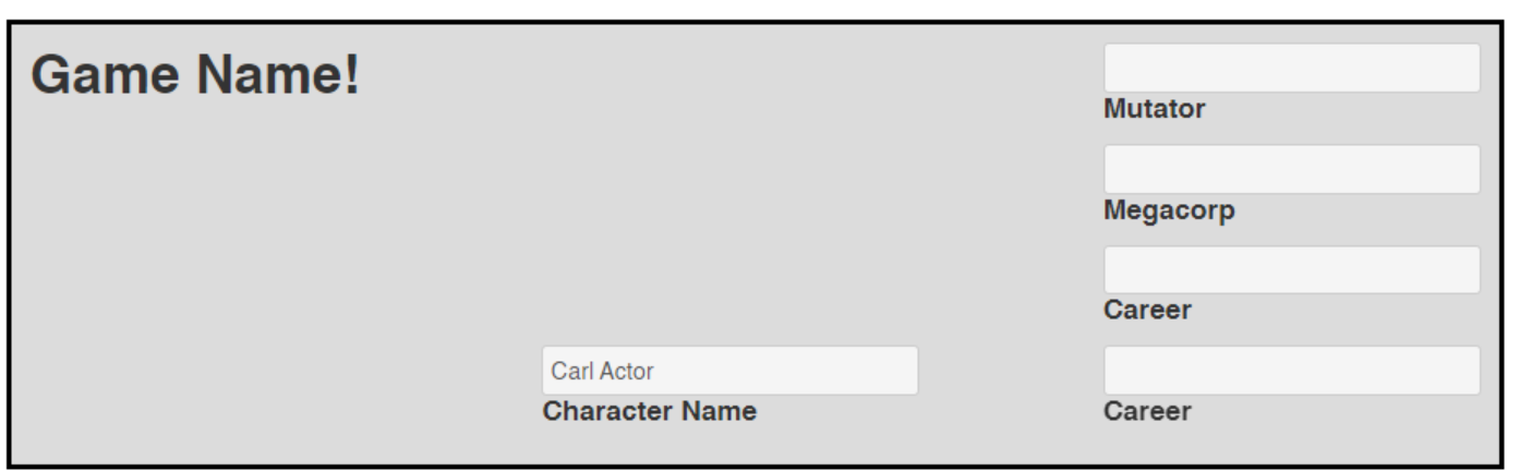
Tada!
I’d include an image here, but it would look exactly like the last one. But now our code is much neater!
One last tweak: we want our label to be underneath our input. No problem!
We just tweak a couple things, using display: flex again!
1
2
3
4
.bottom {
    display: flex;
    flex-direction: column-reverse;
}
 We can clean up the small details later.
Finally let’s rename bottom (in both our CSS AND our HTML) to character-stat.
The Right Side
Now, let’s look at the next item on our list: add Mutator, Career, Megacorp, and Next of Kin.
Your first instinct should be to add another div here, and that’s a good instinct!
1
2
3
4
5
6
7
8
9
10
11
12
13
14
15
16
17
18
19
20
21
22
<div class="section header">
    <h1>Game Name!</h1>
    <!-- ... -->
    <div class="right">
        <div class="character-stat">
            <label class="inline" for="character-mutator"> Mutator </label>
            <input type="text" id="character-mutator" name="attr_mutator"/>
        </div>
        <div class="character-stat">
            <label class="inline" for="character-corp"> Megacorp </label>
            <input type="text" id="character-corp" name="attr_corp"/>
        </div>
        <div class="character-stat">
            <label class="inline" for="character-career"> Career </label>
            <input type="text" id="character-career" name="attr_career"/>
        </div>
        <div class="character-stat">
            <label class="inline" for="character-next-of-kin"> Next of Kin </label>
            <input type="text" id="character-next-of-kin" name="attr_next-of-kin"/>
        </div>
    </div>
</div>
Notice how we re-used the character-stat class we just created
…Unfortunately, this will wreak havoc with our header, since we told the whole header to be display: flex and flex-direction: row. How can we mix and match these?
Easy, more divs!
 That’s not what we want at all!
Let’s wrap the span holding our character name inside a div. And we might as well give it a class of left, to pair with the right we already created.
1
2
3
4
5
6
7
8
9
10
11
<div class="section header">
    <h1>Game Name!</h1>
    <div class="left">
        <span class="character-stat">
            <label class="inline" for="character-name">Character Name</label>
            <input type="text" id="character-name" name="attr_character_name"/>
        </span>
    </div>
    <div class="right">
        <!-- ... -->
Now, let’s make some changes to our CSS. First, .header shouldn’t be a column, it’s going to be a row with left and right. Then, both .left and .right will need to be set to display: flex, and both of these SHOULD have a flex-direction of column. Finally our left class needs a justify-content: end; so that it goes to the bottom of its column, rather than the top.
Note: There’s two ways we could do this. The first way, which we’ve chosen, is to assign the shared properties to both .left and .right. We also could have made a new class (such as “column”) and added it to both
divs. Which you choose is a matter of preference and how often you’ll be repeating these properties.
1
2
3
4
5
6
7
8
9
10
11
12
13
14
.header {
    /* ... */
    flex-direction: row;
    justify-content: space-between; /* delete this */
}

.left, .right {
    display: flex;
    flex-direction: column;
}

.left {
    justify-content: end;
}
Note: The
,selector selectors elements that match either of the options. In this case, both .left and .right.
That’s almost right. But our h1 isn’t centered anymore. Right, because the .header class now has 3 children that it’s setting up in a row. What’s the answer?
More divs!
You got it! We ned our h1 to be its own element, not part of any of this flex business. Then we need another div that contains our left and our right, and that new div will be the one that we flex. sigh. Okay, let’s jump in.
1
2
3
4
5
6
7
8
9
10
11
<div class="section header">
    <h1>Game Name!</h1>
    <div class="header-content">
        <div class="left">
            <!-- ... -->
        </div>
        <div class="right">
            <!-- ... -->
        </div>
    </div>
</div>
We’ll give it a class of “header-content”. It’s a good a name as any.
1
2
3
4
5
6
7
8
9
10
11
12
.header {
    background-color: #dcdcdc; /* A nice light gray */
    grid-area: header;
    display: flex; /* Delete this line */
    flex-direction: row; /* Delete this line */
}

.header-content {
    display: flex;
    flex-direction: row;
    justify-content: space-between; /* Move left and right to opposite sides of the div */
}
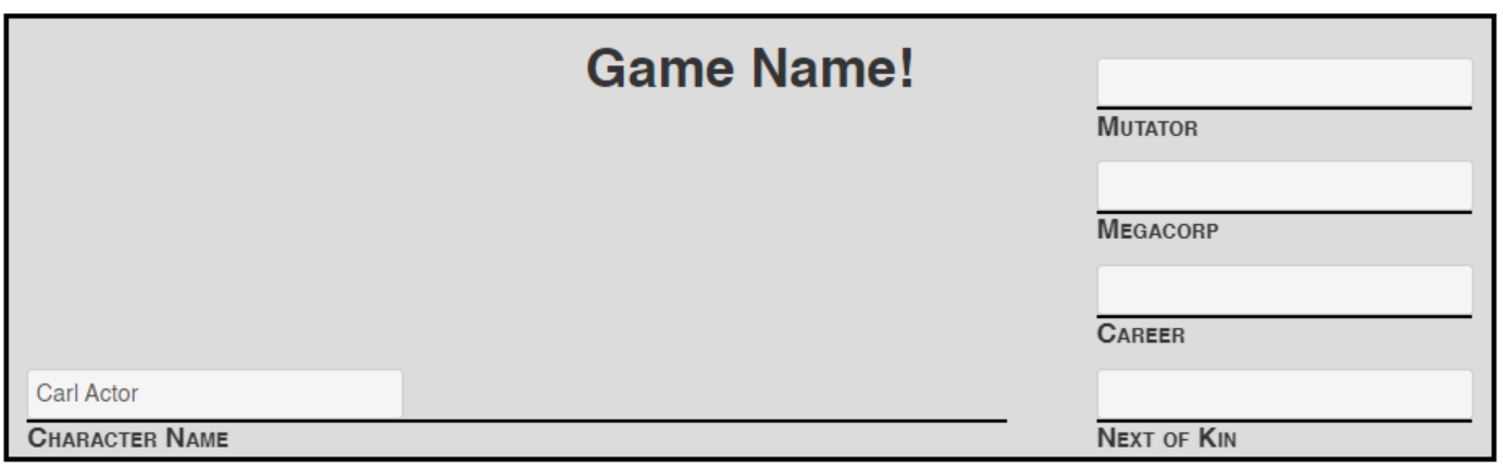
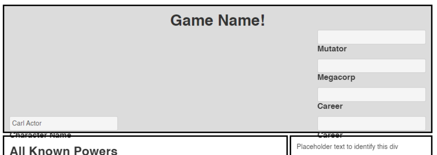 So close!
That’s almost right, but it doesn’t fit! We have two options:
First, we could change our grid-template-rows setting on .character-sheet. Something like 280px instead of 250px should solve the problem.
Or, we can slide our .header-content div up a bit with a negative margin: margin-top: -25px. Either approach works, just depends whether you want a taller header, or if you want the title of your game to share space with “Mutator”. I went with the negative margin:
We’re almost done in this session, just a few small things left.
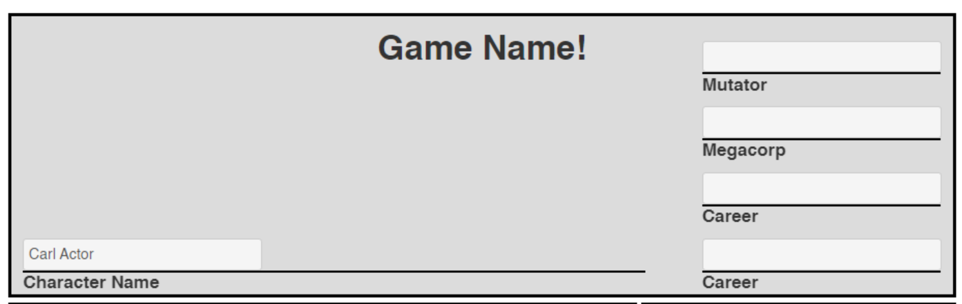
Horizontal Lines and Descendants
We want a horizontal line above each label. One thing we COULD do is add a new <hr> element into every character-stat div. But that’s a lot of repeated code!
There’s an easier way. but it involves learning some new intermediate CSS tricks!
We’re going to use CSS to add a line above each of our labels. First, we need to select the labels with CSS.
While we could just target label.inline, that feels a bit wrong: inline refers to its positioning, so it would be better to either rename the class to something different, or to add a new class to each of the labels (class="inline line-above", for example). But we can do this without modifying our HTML at all!
The [space] Selector
What we really want to match is a label with a class of inline that is the child of a en element (either div or span) that has a class of character-stat. Luckily, there’s a CSS selector for this!
1
2
3
.character-stat label.inline {
    background-color: blue; /* Just to verify that it's working */
}
A space tells CSS that we want an element that is a descendant of another element. CSS selectors are always read right-to-left, so this matches label.inline that is a descendant of .character-stat.
Note: This selector only looks for descendants, not direct descendants (children). If you aren’t careful, you can accidentally match much more than you intend when using the space selector.
 Yup, it matched them all right
Now we just need to add a border before each of these. Remove the background-color and change our css to:
1
2
3
4
.character-stat label.inline {
    border-top: 2px solid black;
    width: 95%; // Don't go all the way to the edge.
}
And, if we want to make the “Name” line longer, we can add
1
2
3
4
.left {
    /* ... */
    width: 70%
}
 Perfect is the enemy of good. We can easily change the color and spacing later on. Broad strokes first, perfection later.
Small Caps
We could go in and change all of our text to be capitalized, but that’s a lot of work, and we already have CSS!
Simply add another property to our label selector we just created:
1
2
3
.character-stat label.inline {
    /* ... */
}   font-variant: small-caps;
 Just like momma used to make!
Bonus: Datalists
Let’s suppose that we want to make life even easier for our players. After all, I believe that should be the goal of all software.
There are only three Megacorps players can choose from. I could make this a dropdown instead of a text field, but that presents a problem: now my character sheet is limiting users!
What if there was a middle ground?
Fear now, there is! Presenting Datalists!
We’re just going to make two small changes to our HTML.
First, we add a list attribute to our input:
1
2
3
4
<div class="character-stat">
    <!-- ... -->
    <input type="text" list="megacorps" id="character-corp" name="attr_corp"/>
</div>
Then, at the bottom of our HTML file, add this:
1
2
3
4
5
6
<!-- Datalists -->
<datalist id="megacorps">
    <option>Goldencalf</option>
    <option>Gargoyle</option>
    <option>Dorsey</option>
</datalist>
Note the matching id.
Now we have a datalist! Prefilled options for the user, but with the flexibility to add their own! Now an expansion or homebrew won’t be limited by my lack of foresight.
 OR the player can type in whatever they want, unlock a dropdown!
Summary
Wow! This sure was a big session, huh? But we learned about flex and the descendant selector, dropped a datalist in, AND finished our header! Next session, let’s fill out the body of our character sheet, and get started with repeating sections!
Code So Far
1
2
3
4
5
6
7
8
9
10
11
12
13
14
15
16
17
18
19
20
21
22
23
24
25
26
27
28
29
30
31
32
33
34
35
36
37
38
39
40
41
42
43
44
45
46
47
48
49
<div class="character-sheet">
  <div class="section header">
    <h1>Game Name!</h1>
    <div class="header-content">
    <div class="left">
      <span class="character-stat">
      <label class="inline" for="character-name">Character Name</label>
      <input type="text" id="character-name" name="attr_character_name"/>
      </span>
    </div>
    <div class="right">
      <div class="character-stat">
        <label class="inline" for="character-mutator"> Mutator </label>
        <input type="text" id="character-mutator" name="attr_mutator"/>
      </div>
      <div class="character-stat">
        <label class="inline" for="character-corp"> Megacorp </label>
        <input type="text" list="megacorps" id="character-corp" name="attr_corp"/>
      </div>
      <div class="character-stat">
        <label class="inline" for="character-career"> Career </label>
        <input type="text" id="character-career" name="attr_career"/>
      </div>
      <div class="character-stat">
        <label class="inline" for="character-next-of-kin"> Career </label>
        <input type="text" id="character-next-of-kin" name="attr_next-of-kin"/>
      </div>
    </div>
    </div>
  </div>
  <!-- End of Header div -->

  <div class="section powers">
    <h2>All Known Powers</h2>
  </div>

  <!-- This is the right-hand sidebar -->
  <div class="section information">
    Placeholder text to identify this div
  </div>
</div>


<!-- Datalists -->
<datalist id="megacorps">
  <option>Goldencalf</option>
  <option>Gargoyle</option>
  <option>Dorsey</option>
</datalist>
1
2
3
4
5
6
7
8
9
10
11
12
13
14
15
16
17
18
19
20
21
22
23
24
25
26
27
28
29
30
31
32
33
34
35
36
37
38
39
40
41
42
43
44
45
46
47
48
49
50
51
52
53
54
55
56
57
58
59
60
61
62
63
64
h1 {
    text-align:center;
}

label.inline {
    display:inline;
}

.header {
    background-color: #dcdcdc; /* A nice light gray */
    grid-area: header;
}

.information {
    grid-area: information;
}

.powers {
    grid-area: powers;
}

/* This applies to every section */
.section {
    border: 3px solid black;
    padding: 10px;
}

.character-sheet {
  display: grid;
  grid-template-columns: 2fr 1fr;
  grid-template-rows: 250px 1fr;
  grid-template-areas: "header header"
                       "powers information";
  grid-gap: 4px;
  height: 800px;
}

.character-stat {
    display: flex;
    flex-direction: column-reverse;
}

.left, .right {
  display: flex;
  flex-direction: column;
}

.left {
  justify-content: end;
	width: 70%;
}

.header-content {
  display: flex;
  flex-direction: row;
	justify-content: space-between;
	margin-top: -25px;
}

.character-stat label.inline {
    border-top: 2px solid black;
		width: 95%;
		font-variant: small-caps;
}