In the last session, we started building an extremely rudimentary character sheet, and got it loaded into roll20. Now, we’re going to build the skeleton of a character sheet worth using.
Getting Started
The first and most crucial step in building a character sheet on Roll20 is to have an idea of what you’re making. If you have a physical character sheet already made, that’s a great start. Otherwise, even a rough sketch on paper will go a long way towards cementing the idea in your head.
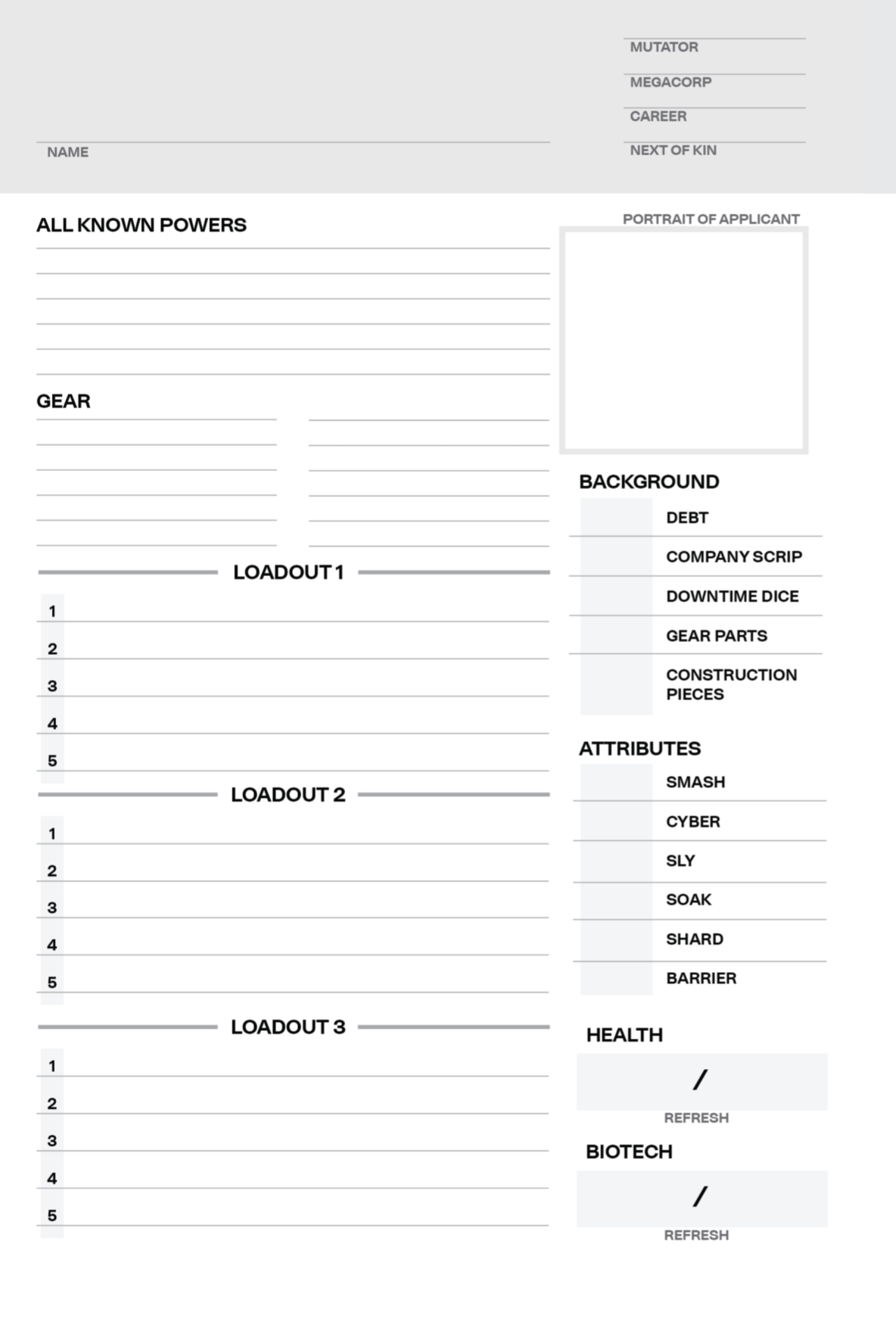
For this tutorial, I will use Cyberrats as the starting point. Below is a picture of the Cyberrats character sheet as it appears in the first printing of the book. We’re not going to replicate it perfectly, but it’s a start.
The crucial piece to note is that the sheet is roughly split into sections. This is an excellent use case for something called CSS Grid, which is my preferred way to lay out a character sheet.
The syntax is a little overwhelming, so bear with me.
First, let’s get an idea of what these sections are. CSS Grid divides a sheet into rows and columns, and it looks to me like we have a grid here with two rows and two columns.
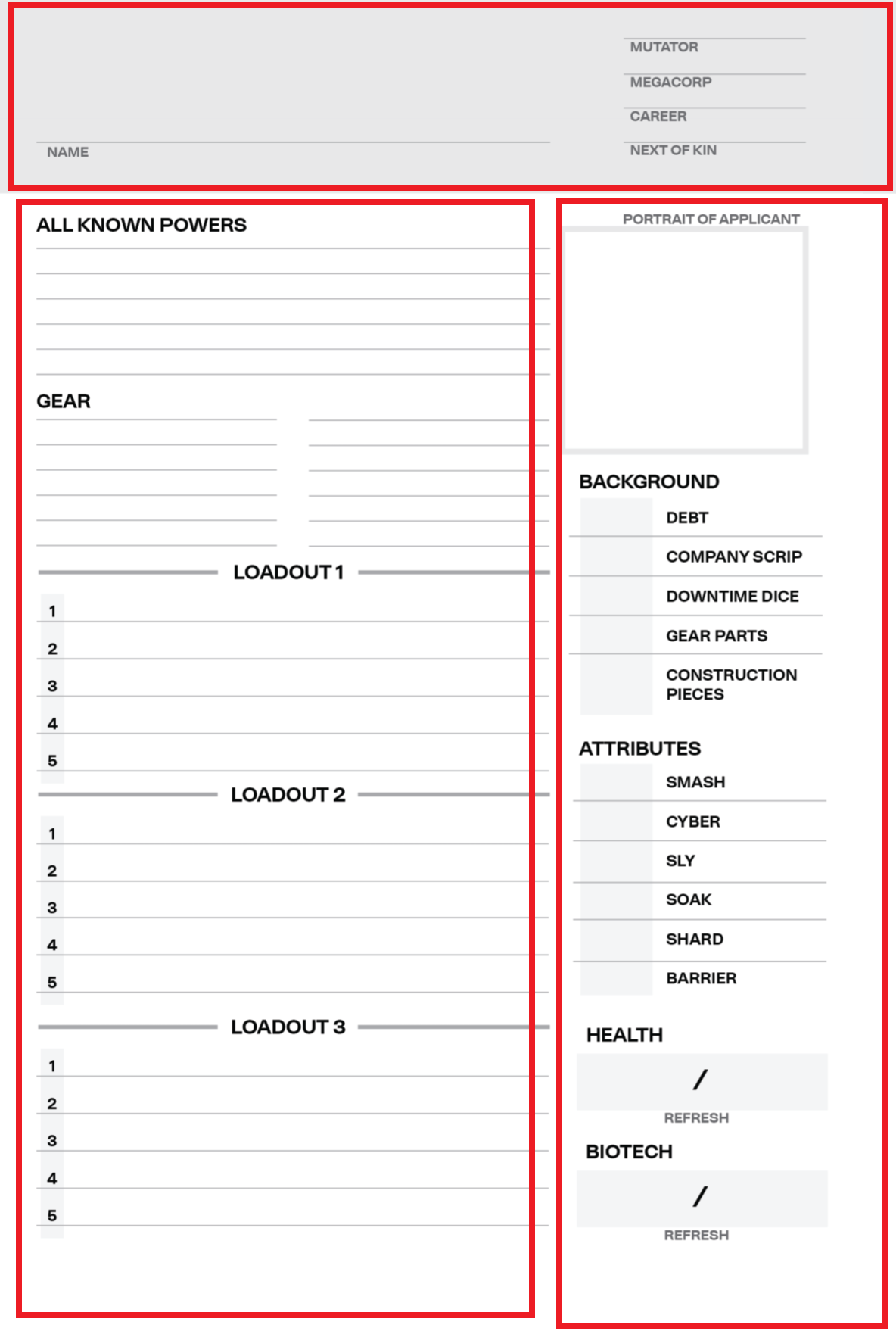 One possible division of the character sheet
We could certainly have split this many others ways, such as using more rows (and in fact, the actual ROll20 sheet for Cyberrats uses four columns), but I want to keep things simple for now.
First, let’s update our HTML to have three divs, one for each of these sections. I’ll give each one a class of “section”, as well as a unique class for its role. The top is already called header, so let’s call the left “powers” and the right “information”. The name doesn’t really matter, as long as it’s clear to me what it’s referring to.
I’ve added an h2 to the powers div, and some placeholder text to the information one. I also added some comments, just to show what that looks like.
1
2
3
4
5
6
7
8
9
10
11
12
13
14
15
<div class="section header">
    <h1>Game Name!</h1>
    <label class="inline" for="character-name">Character Name</label>
    <input type="text" id="character-name" name="attr_character_name"/>
</div>
<!-- End of Header div -->

<div class="section powers">
    <h2>All Known Powers</h2>
</div>

<!-- This is the right-hand sidebar -->
<div class="section information">
    Placeholder text to identify this div
</div>
Let’s load that up in Roll20. Remember, if you’re using the same sandbox session as before, our CSS hasn’t changed, so you can simply click the button to load the HTML with these new changes.
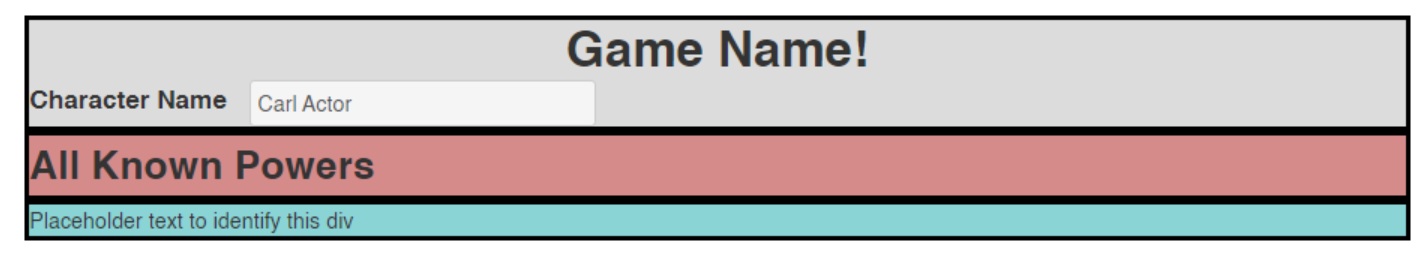
 What a mess!
Let’s add some CSS to that. First, just some background colors so we can easily see where each div is. We’ll remove these later. As before, I’ve added a couple comments.
1
2
3
4
5
6
7
8
9
10
11
12
13
14
15
16
.header {
    background-color: #dcdcdc; /* A nice light gray */
}

.information {
    background-color: #8bd4d6; /* A light blue */
}

.powers {
    background-color: #d68b8b; /* A light red */
}

/* This applies to every section */
.section {
    border: 3px solid black;
}
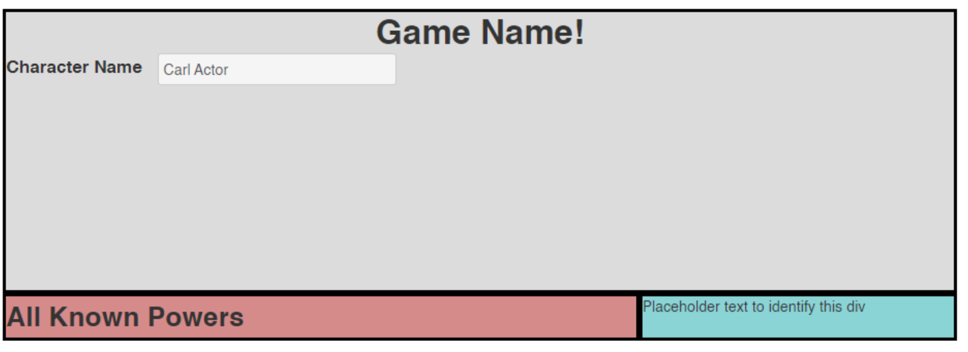
Okay! We load this up into Roll20 and we can see EXACTLY where are divs are! Look at that, they’re all stacked on top of each other, just like we’d expect divs (or any elements with display: block;) to be!
 Still not pretty, but very illustrative
Let’s clean this up. Open your mind, and let me welcome you to the world of CSS Grid.
The World of CSS Grid
The first thing we’ll need to do is make a parent div around the rest of the sheets. This is very common, as a div is just a container. If you ever want to group things, toss them in a div or span.
Let’s make a div with a class of character-sheet that holds the rest of our HTML.
1
2
3
4
5
6
7
8
9
10
11
12
13
14
15
16
17
<div class="character-sheet">
    <div class="section header">
        <h1>Game Name!</h1>
        <label class="inline" for="character-name">Character Name</label>
        <input type="text" id="character-name" name="attr_character_name"/>
    </div>
    <!-- End of Header div -->

    <div class="section powers">
        <h2>All Known Powers</h2>
    </div>

    <!-- This is the right-hand sidebar -->
    <div class="section information">
        Placeholder text to identify this div
    </div>
</div>
Tip: If you’re using a text editor like Notepad++ or VSCode, you can select all of your HTML and hit
tab to indent it all at once
You can refresh the HTML if you’d like, but nothing will change. All we’ve done is wrap this in a container, which is safe. You can have as many containers as you’d like. HTML only renders them if there’s something interesting, like a different property for a child to inherit.
Now, over to our CSS, things get interesting.
First, we need to set .character-sheet to display: grid. This tells our browser to render this div and all of its children like a grid. In order to do that, it needs some information about the size of the rows and columns within it.
This is where things get hairy, so bear with me.
We need to set three properties: grid-template-columns, grid-template-rows, and grid-template-areas.
grid-template-columns says how many columns we would like, and what the size of those columns should be. We could give a value like 400px, which is roughly half of the default width of a Roll20 character sheet, but that wouldn’t scale very well. We could also set it to 50%, but it’s better to use fr.
fr represents the free space in your container, while % looks at the total space. Usually this won’t matter, but it will matter if you set a grid-column-gap to indicate spaces (gutters) between your columns and rows. (see also What is FR?)
It looks like the second column is only half as big as the first column, so let’s set grid-template-columns to 2fr 1fr.
1
2
3
4
.character-sheet {
    display: grid;
    grid-template-columns: 2fr 1fr;
}
This defines two columns (since there are two values given), and sets their relative sizes (see more below).
Then for the rows, let’s have our first row (the header) be a fixed size. Let’s try 250px for now. And then the rest of the content can be one singular row, taking up the rest of the space.
1
2
3
4
5
.character-sheet {
    display: grid;
    grid-template-columns: 2fr 1fr;
    grid-template-rows: 250px 1fr;
}
Finally, grid-template-areas. This property lets us lay out our grid using labels for what containers will map to what portions of the grid. What’s nice about this is that you can technically have your HTML laid out in any orientation that you want, using grid-template-areas will move the relevant sections to the right places. It’s still a good idea to lay out your HTML in a logical way, if you can.
grid-template-areas takes in a number of strings (words or letters surrounded by quotes), where each string is the name of a section separated by a space. These strings together form a grid of the same size indicated by grid-template-columns and grid-template-rows. An example will make things more clear:
1
2
3
4
5
6
7
.character-sheet {
    display: grid;
    grid-template-columns: 2fr 1fr;
    grid-template-rows: 50% 50%;
    grid-template-areas: "header header"
                         "powers information";
}
Here we have two rows and two columns, like we defined. The first row is filled with the header, while the second row is split between powers and information. If you wanted a section to be empty, simply fill it with a ..
Note that only the last line has a semi-colon (
;);
You can lay out your sections however you’d like, as long as each section is a rectangle. So you can have sections spread across rows or columns, but not in any funny Tetris shapes, don’t try it.
Now, we just have to update our CSS to map each of our sections to the words defined in the grid. You can use ANY words in the grid, but it’s good practice to have them line up with the class names of the divs that will go there.
Add the grid-area: property to each of the sections in our CSS, with a value of the corresponding word from our grid-template-areas string.
1
2
3
4
5
6
.header {
    background-color: #dcdcdc; /* A nice light gray */
    grid-area: header;

    /* ... and so on */
}
Then refresh the CSS, and what do we see?
That’s close! Let’s add two more properties to our .character-sheet class.
1
2
3
4
5
.character-sheet{
    /* ... */
    grid-gap: 4px;
    height: 800px;
}
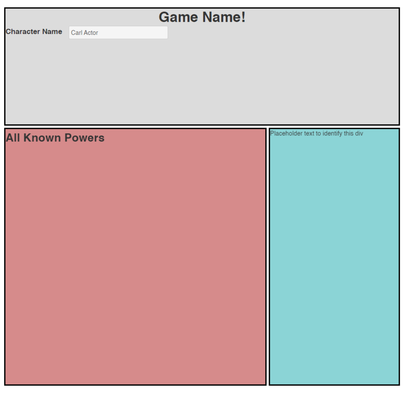 There we go!
The grid-gap adds space between the sections (which makes our choice to use fr over % that much more important). Setting the height gives us room to work, and we could probably get rid of the colors now. All that’s left is filling in the details!
What is FR?
1fr represents one fraction of the space that’s remaining, 2fr is twice that, .5fr is half of that space. So when we set our columns to 250px 1fr, we’re telling the first row (our header) to be 250px, and the second row to fill up to be the entire rest of the space. If we had three rows, we could have done 250px 1fr 1fr to split the remainder evenly, or 250px 1fr 2fr to split them into thirds (with the last row being twice as big as the first).
Summary
Now that we’ve got the shape of our character sheet built, you can play around with it. Add new details, add extra rows or columns! Change the size of things, go WILD!
Or continue to next session as we fill in the details and clean things up a bit.
Code So Far
1
2
3
4
5
6
7
8
9
10
11
12
13
14
15
16
17
<div class="character-sheet">
  <div class="section header">
      <h1>Game Name!</h1>
      <label class="inline" for="character-name">Character Name</label>
      <input type="text" id="character-name" name="attr_character_name"/>
  </div>
  <!-- End of Header div -->

  <div class="section powers">
      <h2>All Known Powers</h2>
  </div>

  <!-- This is the right-hand sidebar -->
  <div class="section information">
      Placeholder text to identify this div
  </div>
</div>
And CSS:
1
2
3
4
5
6
7
8
9
10
11
12
13
14
15
16
17
18
19
20
21
22
23
24
25
26
27
28
29
30
31
32
33
34
35
36
37
h1 {
    text-align:center;
}

label.inline {
    display:inline;
}

.header {
    background-color: #dcdcdc; /* A nice light gray */
    grid-area: header;
}

.information {
    background-color: #8bd4d6; /* A light blue */
    grid-area: information;
}

.powers {
    background-color: #d68b8b; /* A light red */
    grid-area: powers;
}

/* This applies to every section */
.section {
    border: 3px solid black;
}

.character-sheet {
  display: grid;
  grid-template-columns: 2fr 1fr;
  grid-template-rows: 250px 1fr;
  grid-template-areas: "header header"
                       "powers information";
  grid-gap: 4px;
  height: 800px;
}