
This is the first post in the So You Want To Make A Game? series. Like most entries in this series, it was written by a guest author.
So you’ve written (or are writing) a roleplaying game, and now you want to lay it out. Maybe you’re inspired by the RPG books you have at home, or maybe you’ve heard you need to have a nice layout (you don’t, but that’s a whole manifesto I won’t hit you with just yet), or maybe you know that it’s easier to market or pitch a game that’s a little gussied up.
Regardless, you want to do some layout work because you’re just one designer, not a big company, and you can’t afford to hire someone to do it for you. But you don’t know where to start!
Lucky for you, this blog can help you get started.
Before You Start
First things first, there are a few questions you should ask yourself before you start designing.
1. What medium am I publishing this in?
When I say ‘medium’ here, I mean are you creating a digital file only? A print book? A print and play document, which players can print at home themselves? Or something else?
It’s important to ask this question for technical reasons, like the color settings of your images (RGB for screen, CMYK for print), how wide the margins should be based on the type of book binding you might use for a physical edition, and how much ink a home printer will have to use.
Those details might sound like a lot, but there are tons and tons of more in-depth guides out there to answer those particular questions. The printer you select to print your book (Mixam is a popular one) will often have recommended measurements to use, or even a template. You won’t have to puzzle all that out alone!
2. What format is the game?
When I say ‘format’ here, I mean what size are your pages, and how are they oriented? While this certainly matters for print, if you’re doing a digital file you may want to think about how the game is viewed on a phone or tablet. Further, is it black and white or color?
3. Who is my audience/what is my theme?
It may not feel obvious to consider the audience and/or theme of your game in the layout design, but I find it’s important to think about it intentionally. What colors, shapes, and elements feel like they fit? Are there existing layouts or designs that you’re inspired by? What pieces of them inspire you, and why?
This is a good place to ask yourself what you want out of the layout, and you probably already have a good idea of that, even if the answer is “I don’t want my game to be just a plain word document”. Play with moodboards, throw together just a couple pages with dummy text, do some tinkering to see what feels right before you get thirty pages deep.
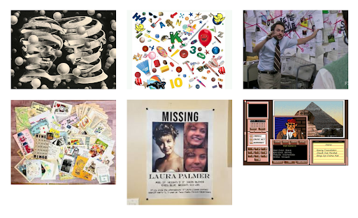 Very simple moodboard for an actual project to try and capture some of the feelings I want to evoke.
What Program Do I Use?
“But how do I lay something out? What program do I even use?” Lucky for you, there’s a bunch of options out there (more even than I’m going to discuss here), all ranging in complexity and pricing. Let’s start with free and easy.
-
Slides/Powerpoint (free with gmail or microsoft account)
The ultimate quick design tool. We’ve all had fun making PowerPoints before, right? Slides isn’t the most elegant design tool, but it can make something pretty in a pinch. You can create backgrounds, use any Google fonts, add shapes, images, and other elements. You can even change the size and orientation of your slides.While I don’t particularly recommend this one for print projects, I know plenty of designers who put together their digital (and sometimes even print and play) projects in Slides to great effect.
-
Canva (free with account, with the option for a paid premium account)
This is a fairly straightforward online WYSIWYG (wizz-ee-wig, what you see is what you get) tool for graphic design. It has tons of templates, drag and drop tools, built-in fonts and graphic elements, and generally is just very useful for someone with little experience or who needs to whip something up fast.Once again, I wouldn’t recommend using this for print, necessarily, though you can — they have a whole section of print templates, but it is largely invitations and similar items.
- Affinity (one time payment)
Affinity is where you start to get into more robust tools. This software suite contains three programs: Publisher, Designer, and Photo.- Publisher is best for layout work for print and digital files.
- Designer is best for creating vector art.
- Photo is best for editing photos and images.
You can buy all three, or just one or two. This software often goes on sale, so keep an eye out if that price tag feels too expensive up front! Affinity has a ton of tools and tutorials to help you get familiar with their interface.
- Adobe InDesign (subscription fee)
This is the software I personally use, and is generally considered the “professional” standard (though Affinity does just as well, in my experience). It’s extremely robust, but unfortunately so is the recurring price tag. Again, there are tons and tons of tutorials for using the software if you choose to go this route.
Ready to Design
So now you’ve got your document open. You’re ready to put words and pictures on the page. But how do you make “good” design? (There’s another manifesto within me about how universal good design doesn’t exist, only “good for your project” design, but again, I shan’t bore you with it).
There’s a few main elements I’d suggest you consider when you lay out a game. I’m trying to distill many years of design school and experience into the MOST IMPORTANT bits, so just know there’s a lot more out there if you’re interested in learning more! These elements all feed into one another, but let’s break them down individually.
1. Composition/Flow
Composition is how the elements on a page are organized. Flow is how they direct a reader’s attention. If I put a massive bold bit of text at the bottom of the page, that’s likely going to draw the eye first, even if it’s the last place someone would start reading.
Biggest piece of advice regarding composition: You don’t have to fill the whole page. Even if you’re going for a busy or hectic design, white space is your friend! It’s okay to let the elements on the page breathe a little and have space from one another.
Something that can help organize your composition is setting up specific styles for headers, body text, and even bulleted lists. Most programs allow some customization of styles so that you don’t have to modify a ton of different elements for every single line of text that needs to be formatted in the same way.
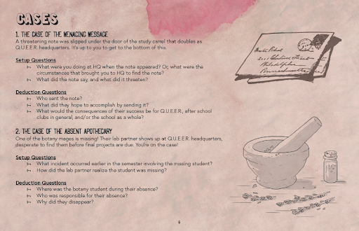 A clear stylistic hierarchy.
Questions to keep in mind for composition: How_ many columns am I using? What information is most important on this page? What does a reader look at first on the page? What do they look at next? Is there text that’s always getting skipped over? Is the sidebar formatted in such a way that it’s clearly delineated from the body text? Does this make sense, in the order it is currently organized?
2. Color and Type
“I know what color and type are,” you think, “I’ve played with fonts in Word plenty.” And you’re right! You do know what those things are! But when you’re designing a book or game for people to read, you have to put aside personal preferences sometimes. A “cool font” might not be legible at all. Best not to put your whole body text in Chiller. Similarly, you might LOVE red. But do you want the background of your pages to be red? Probably not!
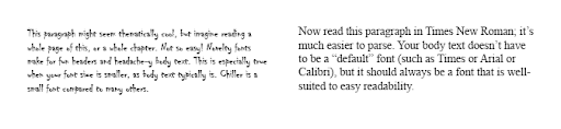 Font can make a huge difference.
With text, I recommend creating a simple hierarchy. Pick a body font that’s legible and simple. Then decide on headers (probably a very large header/title, and a smaller subheader), and figure out whether those are different fonts or just a bold version of your body text. Try not to go too overboard with fonts. More than three on one page tends to be overwhelming.
With color, think about the person reading this on your chosen medium (screen, printed pages). Light on dark text is harder to read versus dark text on a light background, as a general rule. Color is an amazing tool for directing attention and creating interest, but just as with fonts, too much on one page can be overwhelming. Picking a color scheme can help direct your color usage.
Questions to keep in mind for color and type: How many fonts am I using? How many colors? Is my color usage consistent on the same elements across multiple pages? Do the “rules” I’ve set up for which fonts and colors get used where help the reader? Are these fonts and colors readable?
3. Icons and Imagery
This piece is any art you have, graphic elements such as fancy header underlines, random shapes that aren’t part of the text, etc etc etc. If you don’t already have art, you can find royalty-free or public domain art in any number of places.
You don’t have to slap an image on the page and be done with it, though you can. Most of the programs I mentioned earlier allow you to resize, crop, play with opacity or color, and otherwise modify images.
Questions to keep in mind for icons and imagery: How do my images balance with my text? Is there enough space given to both? What draws the reader’s eye first? Are my graphics arranged in a way that supports the composition’s flow?
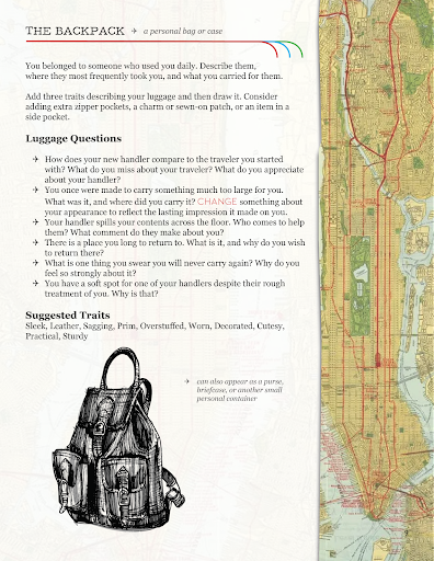 Balancing the graphic elements with the text can be a challenge.
So Now What?
Hopefully this blog has given you some tools to get you started with layout. Cramming the basics of graphic design for layout into a single post feels impossible, and to that end, there are tons more resources out there if you want to get more nitty gritty than I did here.
Some of my favorites: Explorer’s Design Design Basics Index The Design of Everyday Things
There’s always more to consider with design — accessibility for people with varying disabilities, publishing and printing specifics, any number of conversations about text size — but as a beginning designer, it’s important to focus on putting together a design that appeals to you and your readers.
I can’t wait to see what you’ve come up with!
- Lady Tabletop
Want more? Check out Lady Tabletop’s Itch page and portfolio!